You are reading docs for v2, click here for the latest version.
- elements:utilities
- introduction
- getting-started
- routing
- utilities
- elements:layouts
- elements:action-bar
- elements:components
- elements:dialogs
- elements:utilities
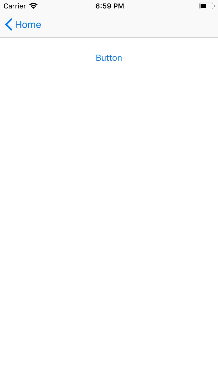
Button
This is an overview of the most common usage of Button. For more information about the available properties, methods, or events, head over to the complete API documentation for Button.
<Button> is a UI component that displays a button which reacts to a user gesture.
For more information about the available gestures, see Gestures in the official NativeScript documentation.
<Button text="Button" @tap="onButtonTap" />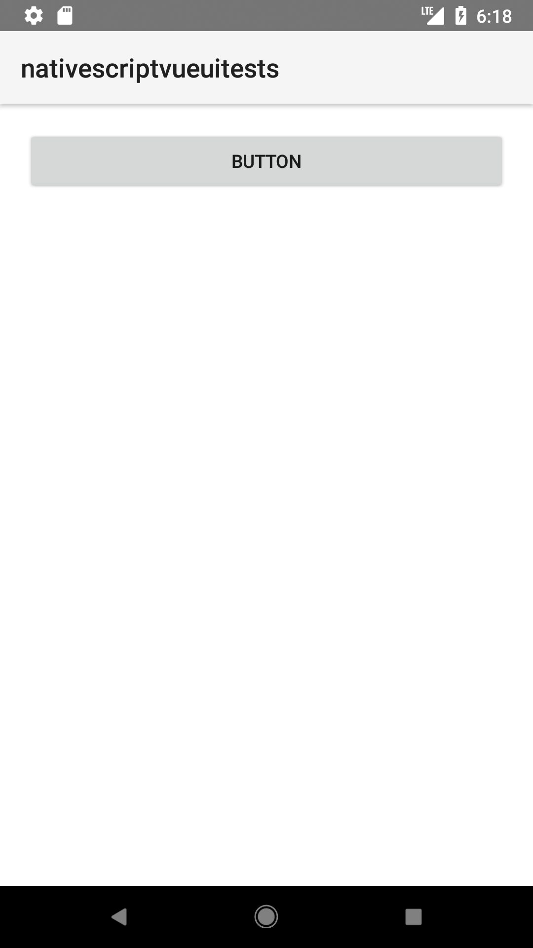
Styling the button
If you need to style parts of the text, you can use a combination of a FormattedString and Span elements.
<Button>
  <FormattedString>
    <Span text="This text has a " />
    <Span text="red " style="color: red" />
    <Span text="piece of text. " />
    <Span text="Also, this bit is italic, " fontStyle="italic" />
    <Span text="and this bit is bold." fontWeight="bold" />
  </FormattedString>
</Button>
Props
| Name | Type | Description |
|---|---|---|
text | String | Sets the label of the button. |
textWrap | Boolean | Gets or sets whether the widget wraps the text of the label. Useful for longer labels. Default value is false. |
isEnabled | Boolean | Make the button disabled or enabled. A disabled button is unusable and un-clickable. Default value is true. |
Events
| Name | Description |
|---|---|
tap | Emitted when the button is tapped. |
Native component
| Android | iOS |
|---|---|
android.widget.Button | UIButton |
Contributors