You are reading docs for v2, click here for the latest version.
- elements:utilities
- introduction
- getting-started
- routing
- utilities
- elements:layouts
- elements:action-bar
- elements:components
- elements:dialogs
- elements:utilities
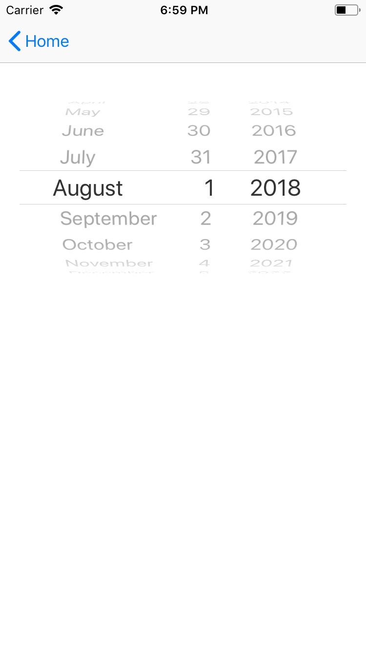
DatePicker
This is an overview of the most common usage of DatePicker. For more information about the available properties, methods, or events, head over to the complete API documentation for DatePicker.
<DatePicker> is a UI component that lets users select a date from a pre-configured range.
See also: TimePicker.
<DatePicker :date="someDate" /><DatePicker> provides two-way data binding using v-model.
<DatePicker v-model="selectedDate" />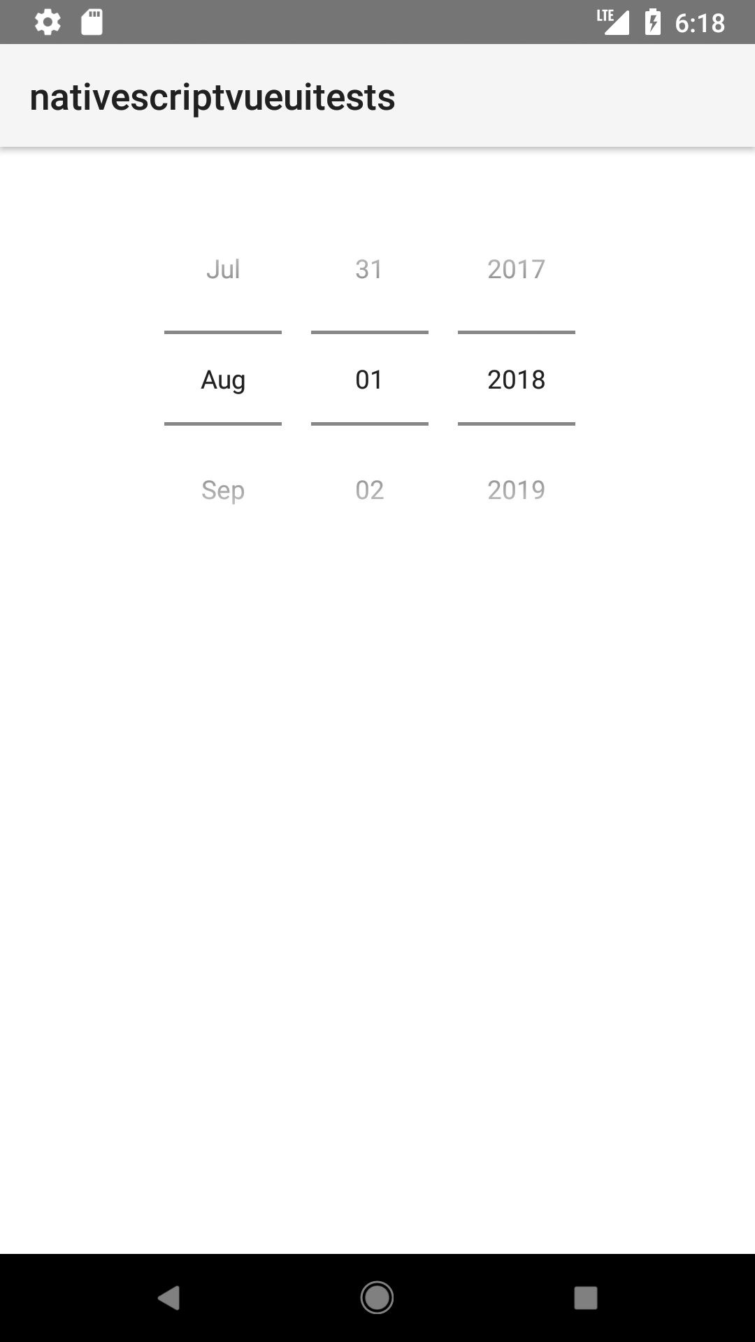
Props
| Name | Type | Description |
|---|---|---|
date | Date | Gets or sets the complete date. |
minDate | Date | Gets or sets the earliest possible date to select. |
maxDate | Date | Gets or sets the latest possible date to select. |
day | Number | Gets or sets the day. |
month | Number | Gets or sets the month. |
year | Number | Gets or sets the year. |
Events
| Name | Description |
|---|---|
dateChange | Emitted when the selected date changes. |
Native component
| Android | iOS |
|---|---|
android.widget.DatePicker | UIDatePicker |
Contributors