You are reading docs for v2, click here for the latest version.
- elements:utilities
- introduction
- getting-started
- routing
- utilities
- elements:layouts
- elements:action-bar
- elements:components
- elements:dialogs
- elements:utilities
TextView
This is an overview of the most common usage of TextView. For more information about the available properties, methods, or events, head over to the complete API documentation for TextView.
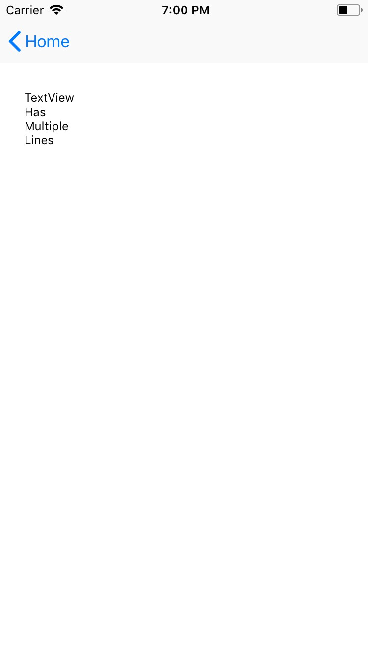
<TextView> is a UI component that shows an editable or a read-only multi-line text container. You can use it to let users type large text in your app or to show longer, multi-line text on the screen.
<TextView> extends TextBase and EditableTextBase which provide additional properties and events.
<TextView text="Multi\nLine\nText" /><TextView> provides two-way data binding using v-model.
<TextView v-model="textViewValue" />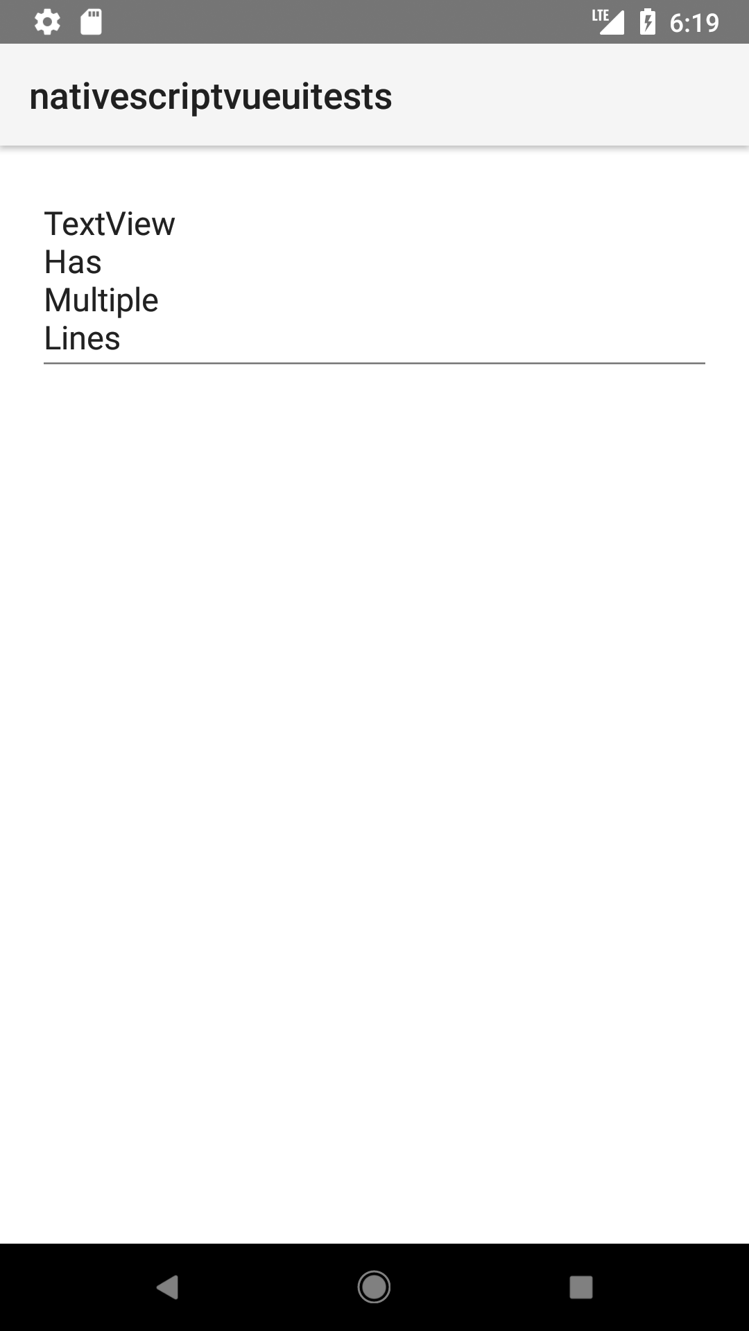
Displaying multi-style text
To apply multiple styles to the text in your <TextView>, you can use <FormattedString>
<TextView editable="false">
  <FormattedString>
    <Span text="You can use text attributes such as " />
    <Span text="bold, " fontWeight="Bold" />
    <Span text="italic " fontStyle="Italic" />
    <Span text="and " />
    <Span text="underline." textDecoration="Underline" />
  </FormattedString>
</TextView>
Props
| Name | Type | Description |
|---|---|---|
text | String | Gets or sets the value of the component. |
hint | String | Gets or sets the placeholder text when the component is editable. |
editable | Boolean | When true, indicates that the user can edit the contents of the container. |
maxLength | Number | Sets the maximum number of characters that can be entered in the container. |
keyboardType | KeyboardType | Shows a custom keyboard for easier text input. Valid values: datetime, phone, number, url, or email. |
returnKeyType | Gets or sets the label of the return key. Currently supported only on iOS. Valid values: done, next, go, search, or send. | |
autocorrect | Boolean | Enables or disables autocorrect. |
Events
| Name | Description |
|---|---|
textChange | Emitted when the text changes. |
returnPress | Emitted when the return key is pressed. |
focus | Emitted when the container is in focus. |
blur | Emitted when the container loses focus. |
Native component
| Android | iOS |
|---|---|
android.widget.EditText | UITextView |
Contributors