You are reading docs for v2, click here for the latest version.
- elements:utilities
- introduction
- getting-started
- routing
- utilities
- elements:layouts
- elements:action-bar
- elements:components
- elements:dialogs
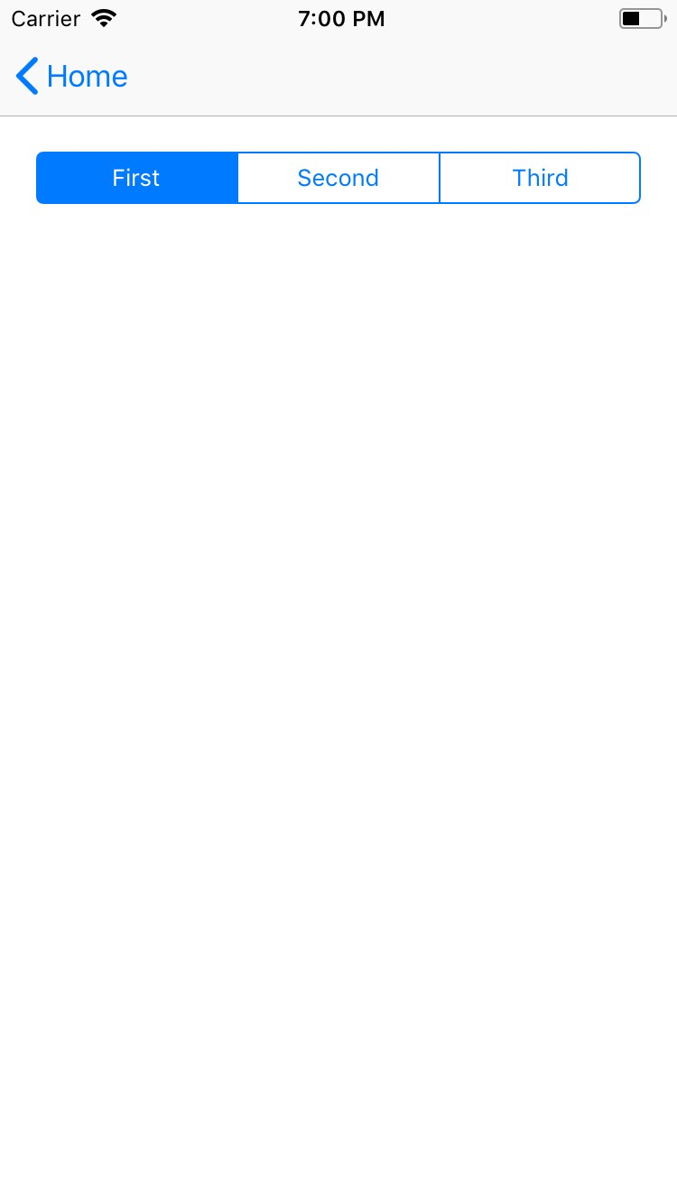
SegmentedBar
This is an overview of the most common usage of SegmentedBar. For more information about the available properties, methods, or events, head over to the complete API documentation for SegmentedBar.
<SegmentedBar>は複数のボタン中から一つだけ選択するために使うUIバーのコンポーネントです。テキストか画像を表示できます。
<TabView>と対象的な点:
<SegmentedBar>の位置は固定されていません。- このコンポーネントはページ上かハンバーガーメニューのようなページに追加されたエレメンの中に配置し、スタイリングをすることができます。
- 選択後に表示されるコンテンツについては別に管理する必要があります。
<SegmentedBar>
  <SegmentedBarItem title="First" />
  <SegmentedBarItem title="Second" />
  <SegmentedBarItem title="Third" />
</SegmentedBar><SegmentedBar :items="listOfItems" selectedIndex="0"
@selectedIndexChanged="onSelectedIndexChange" /><SegmentedBar>はv-modelによる双方向バインディングを提供します。
<SegmentedBar :items="listOfItems" v-model="selectedItem" />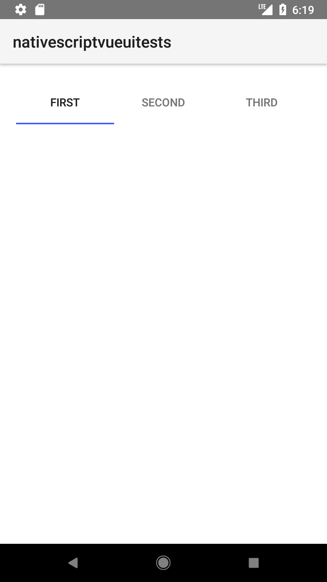
Props
| 名前 | 型 | 説明 |
|---|---|---|
items | Array<SegmentedBarItem> | セグメントバーの中に表示される要素の配列。セグメントバー内のボタンのラベルかアイコンとなります。 配列はあらかじめ生成されている必要があります。 |
selectedIndex | Number | 選択された要素のインデクスを取得・設定します。 |
selectedBackgroundColor | Color | (スタイルのプロパティ) 選択された要素の背景色を取得・設定します。バーの全体に背景色を設定するにはbackgroundColorを使ってください。 |
Events
| 名前 | 説明 |
|---|---|
selectedIndexChanged | セグメントバーの要素がタップされたときに発火します。 |
Native component
| Android | iOS |
|---|---|
android.widget.TabHost | UISegmentedControl |
Contributors